Friday, March 13, 2015

Welcome to The Wall


 THE CARDS!
All designed in Photoshop,these cards were designed for a game fittingly titled "The Wall". So of course I had to give it a Game of Thrones theme. (Is anyone surprised?)

The idea was I had to design four cards: A card back (The first image), a Wall (The second image), a Reinforcement card (The dragon) and a Damage card (The Battering Ram). I drew it all by hand (Yep, even the dragon!) in Photoshop with the use of my Cintiq tablet. The lines for the Wall card back were so good, I copied them for my Wall picture, but without the extra bleed colours. To fit the style, I used a much sharper style with the Wall, the Damage card, and the Reinforcement card than I did with the card backgrounds. 
I feel like I could have been more consistent with the style (I shade a little bit on the Battering Ram, but probably not where it counts most, due to the late hour I was working on the cards no doubt), and I could have been more consistent with the lettering (The text is red on the dragon card because black would have bled into the dragon image, unfortunately. I'm still not completely happy with it, but it was incredibly late when I was finishing it, and I deemed it tolerable). But all in all, I don't think it was too bad! I could do more of these at some point in the future, really. 
(Also, the perspective doesn't look like total crap on the walls, so I'm happy!)

Art Deco: The Rookery


So it wasn't said that we had to post this, but I will anyway. An Art Deco poster assignment!
It lacks the grain that's on many art deco posters, but I don't mind too much, the sharp colours and almost cut-out look. Once again it has to feature a crow, because this was a poster for The Rookery, The castle base is from somewhere in the UK again. I have so many stock pictures from the UK, of course I'm going to keep using them. 

The look I was going for is establishing the design for 'The Rookery', a castle for a hypothetical family in Game of Thrones. Or just any generic castle, but I like the Rookery, I think it has a nice sound. Originally I was going to put a person in, too, but it just seemed like too much when I could be emphasizing the awesome castle!

I could've gotten more detailed on the architechture, but I opted not to, it would've taken more time and probably taken away from the stark detailing.

The image was made in Photoshop, the text applied with InDesign.

Sunday, March 8, 2015

Winning a Kingdom (By Deception)

As many of my friends know, I've been deep into the Song of Ice and Fire series lately (Finished book 1 in under ten days, about to start book 2. No spoilers!) So I opted to make a quick infographic about how to win a kingdom by deception. Anyone can win in an honourable fight with enough soldiers and knights, but it takes true mastery to win a kingdom by deception!

In the PDF, the rollovers are a burgundy colour, and it all seems pretty flawless... except that saving the file as a PDF deactivates the links. I checked, I couldn't find any way to make the "go to page" button work, making the interactivity part of the interactive PDF utterly pointless. Hopefully I can fix this in class, but if not... I tried. I did. It just doesn't function because reasons. That's all I got.

I drew up the image in Photoshop, popped it into Illustrator to livetrace it, and made it all work in InDesign with a little work. All in all, it was kinda fun! If I can figure out how to make the interactivity work in the future, I might make a lot more of these!

Zoetrope crows.


my zoetrope of crows flying. They're really only prepared for one wing flap, but if I made the animation take any longer, I'd need to make everything huge for anything to be visible. It's about a five-frame animation, I think.

This wasn't too terribly difficult, but I did have to monitor how the layers worked in Illustrator, and once again the render time was abhorrent. This is primarily my fault still, my computer is in desperate need of cleaning up, and I still haven't done that. (I like to hoard videogames onto my computer, but constantly neglect to play them because I have other things I feel like I need to do).

If I were to do this again, I might try to find a way to make the animation smoother, but once it rendered out, it actually turned out quite nice. I certainly don't mind it.

And of course, my theme of crows again. It was an easy enough thing to find, so why not?
(The images of crows flying were found online and livetraced, I can't claim to own them.)

Friday, February 27, 2015

Spud Goodman Newsletter


Today I had to work on a newsletter for the Spud Goodman Show. The thumbnail isn't great, admittedly. It looks a lot like the one that showed up in the demo Brian Martin did, but I used some colour palates from the first image to change the background, links (except they wouldn't work on the email links for some reason) and emphasize bolded parts, and I bolded the famous names as well, because the big glob of text wasn't giving me anything to look at. I thought some bolding might make it all more interesting to look at and emphasize the stars. 
I had some difficulty with the text sizes, the live view and the working view of the set were completely different. I also didn't feel like the direction on how to make the links work was very clear, but I figured it out (after posting the whole thing to the web server we use for DDSGN 150). 

It was a little difficult, but not too bad. Easy enough in Dreamweaver with a bit of Photoshop.

Another Wordpress Site

I'm getting mighty sick of blogs I have to make for these classes. That's two wordpresses and at least one blogspot for classes. Ah well.

With that, the link to my new Wordpress, which I'm not sure I'll use after this:
https://smorstan.wordpress.com/

And a screenshot:


This assignment wasn't particularly difficult, just prodding around the site to make sure everything was done properly.

I'm not terribly fond of the colour schemes for the page (there were only three to choose from). I chose one that worked with the header image I picked (again, not great, but it was what I had available). I might actually use this site at some point for a portfolio page someday, too.
The menu is hidden behind that box in the upper right-hand corner, once you click it, the menus show up. I'm not sure if the menus always have to be hidden, but I thought it was nice and minimalist, so I went for it. Hopefully it'l be a hit. (I'll consider changing that header image soon, once I've got some other things up on the page. Providing I ever make more stuff to put on the page.)

Saturday, February 21, 2015

Dreamweaver Doozy

So I had to make an image and turn it into a webpage as well, this week.


I've been reading lots of Game of Thrones lately, and opted to make a GoT inspired webpage as well for my own hypothetical house. (Because I am a colossal neerrrrd).

When the website is viewed, you can roll over the navigational buttons, and the buttons get stricken out and turn a bloody colour, with a few bloodspatters. The site is unfortunately full of jpeg artifacts, which I would fix if I were to do it all again, but as it is, I think it's not... the worst thing ever. I've certainly made better webpages, though. I like my divs a little more than using the slice tool, I find. Which I never thought I'd say. Divs drive me nuts.

SLAM covers


Alright, we all know I have a thing for crows by now, I'm sure. So when assigned to make a SLAM (Student Literary Arts Magazine) cover, I had to go with a native-american styled crow. (Fun fact: According to something like the 'native American zodiac' if you care to call it that, I'm a Raven. I don't really take stock in these things, but it's a cute factoid, though I have no idea who establishes these zodiac rules). 
With it, I made a little raven Folio. The next one is a cover comprised of pictures from my trip to the UK. There's two irish coasts, a British building, and a statue of Sherlock Holmes all in the same image. For a folio, there was nothing especially iconic from the latter picture, so I drew up a quick version of Sherlock's pipe. It might be cheating a bit, but it was the best I had.

I used Photoshop and my Cintiq tablet to create all four images, the Crow cover being entirely my drawings and some royalty-free stock images of the moon and the Earth (though the ravens were based on some royalty-free stock photos as well), and the Holmes cover being entirely my own photos with filters and colouring. I couldn't say which was harder, but I had to press my imagination a bit to come up with new ideas.

Shape Animation

Post one of three for today, is Soul of Silicon. The idea was to make a simple animation with the shape tool in Adobe After Effects. Being who I am, I of course opted to work with a robot.

My biggest problem here was probably the layers. I'm still not entirely certain how layers work, or rather how to make new ones, but I think I did alright. I think this was truthfully done with just two layers, and a bunch of shapes on the same layers. Not my ideal, but it worked out alright.

The idea behind the wordless story is a robot briefly enjoying a moment of humanity as its little heart beats, then shorting out. Its soul flies off as it passes on. Not bad for a thirty second animation with the shape tool, I think.

Sunday, February 8, 2015

Thematic Text Before and After


These I made in Photoshop, and animated with Adobe Edge. 
I chose the word based on a Lindsey Stirling song by the same name, and partly because I had a Pinterest tutorial open that showed how to draw crystals. I didn't really take it precisely, and the crystals look a little bit soft for my taste, but I think it shows the meaning of the word, and doesn't look half bad while animated, either. (The actual animation has the before and after buttons, of course, these are just the before and after images themselves). Rather than white text, I opted for a very pale blue, it seemed more in-theme.

The project wasn't terribly difficult, but if I were to do it again, I think I would have spaced the letters a bit further and made them cel-shaded rather than soft shaded as they are here. Live and learn. All the same, I don't think it's too bad, either. 

Drawing Tablet Artwork

This week, my first of two projects was "draw something with a drawing tablet".

I have a Cintiq tablet at home, the third tablet I've ever owned. While it's a bit fiddly with its cords, it's a fantastic bit of machinery,  and even displays what I'm looking at, making it very useful (though I wish I had two screens to use it with). At any rate, using a Wacom tablet isn't a new thing to me. So as an entirely unrelated project, I was commissioned to draw a piece for a friend online. The friend offered to pay me up to $30 for a drawing of her character, and I was perfectly ready to jump at the chance! With that, my drawing (the "trial" version):


Yes okay it's a dreadful watermark, but that's not the important thing here.
I worked in Photoshop, with primarily hard round brushes. There are flat colours in this, but overtop of those is a shadow layer and an overlay highlight layer, which I think makes up for the 'flat' colours. This is just how I start most of my pictures. The background was a quickly whipped-together cloud (I had already gone well past my three-hour time allotment for this picture) but the important part is that the piece is done. A fairly well-designed anthro character (their design) for the commission price. I still have yet to get their reaction, but I imagine they're likely to enjoy it. 
Most everything I draw digitally is with a tablet, so this really wasn't a challenge for me. I just had to show off whatever I worked on most recently, and this was it!

Friday, January 30, 2015

A simple gallery

So after struggling with a two-hour render time for the last project, I whipped together a simple Galleria project as another assignment.

This is pretty rubbish. I'll admit that readily. I slapped in a couple of divs, and posted it to a remote server. But in all fairness, posting it to the remote server was kind of a maze, since I wasn't really sure what to do with a project that already had a main page and a title and all that, especially since we're all posting to the same remote server. I may have accidentally saved over someone else's assignment, which was only named "Test". I promptly re-submitted mine with a proper name, but I do feel bad for whoever's slideshow was simply named 'test'. I had no idea what I was doing, and I'm guessing if theirs was submitted as 'test', they probably didn't either. My sincerest apologies to whomever I may have accidentally saved over.

Still, even if the simple divs were only simple divs, the page doesn't look too rubbish, so at least I didn't ruin anything else. I hope that's good enough. Soon I'll know enough about Dreamweaver that I'll be able to make much nicer things, though!


A Popup slideshow


This one was a "simple" 3D slideshow. Not hard to make, but exceptionally hard for a computer to render, apparently, as it took me about two hours to render. Images are from me at various points of time. Some of them even have my old surname on them.

I'm not a fan of how the shadows sit on other pictures, and some of the pictures are hovering slightly, but considering the two-hour render time, it wasn't worth going back to fix. I'm not sure why I didn't see the floating before that, however. 

I didn't mind this project, but if I were to do it again, I'd try to do it on a beefier computer. Which says something, as I'm on an (admittedly slightly older) Alienware laptop. 
Hey, at least the art's alright. (The drawing furthest to the left is one I drew just last night and thought looked nice. It's rather washed out here, unfortunately). 

Wednesday, January 28, 2015

Vinyl Fear

So if this post is a mess, that's because it's being made by phone, and historically, blogger does not work well with these devices. 

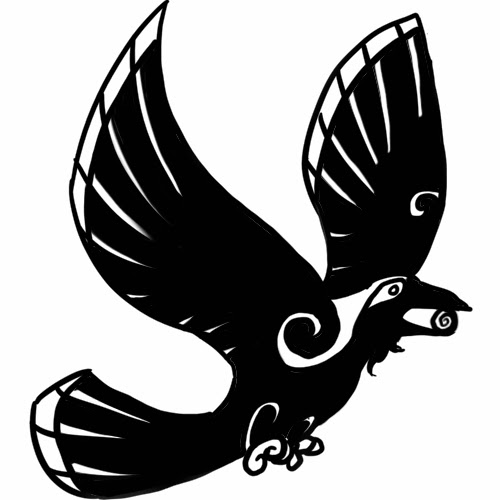
The assignment I am submitting was a vinyl sticker project, designed in Adobe Illustrator and turned into cut vinyl. I really like how the finished product looks! If I had to do it again, I would be more cautious about lining up the pieces and draw the raven myself (it's actually a vectored stock image, but if I were to put it in a portfolio, I would draw it myself, and I have every intention of doing so). Below is the sticker put on my bedroom door. I have a problem with things being permanent, though, so it's actually cut out around the plastic and taped to the door so it can be moved elsewhere someday. It's an eight inch sticker, so it's hard to find a good place for it. Right now, it's covering a dent in my door that's been there since I moved in.

Sunday, January 25, 2015

Back to R'leah: The Font

So the last assignment I was tasked with was to make a font!

"Cool. What should I make it as?" I asked myself. So I looked at Illustrator's brushes, tinkered a little with the basic stuff, and found myself an idea: Cthulhu mythos!


The former is my capital letters, and the latter is both lowercase letters and symbols. Sadly, the font makes it lose some of its lovely detail when put into use, but it still looks pretty good in my opinion. I haven't yet figured out how to type with it (or submit the text file).
I did, however, decide to use it for a header.

And I think it looks pretty good. Particularly the Xs and Ss, they look pretty fine. I added a few other characters I use fairly often. I think I could get used to making fonts, but it certainly takes a while. In the future though, I'll try to do some less wispy edges, it'l make the font look more substantial. But for cthulhu mythos, a little wispy seems alright to me.

NOTE: We also had an assignment to make a vinyl sticker. I'll be adding this to the blog tomorrow evening, most likely. I want to stick it on a door or somesuch. before I get a picture. I'm quite proud of it, so it will certainly appear in the near future on this blog.

Wednesday, January 7, 2015

A meal in memory


This is my first video for Digital Design 220, but nothing too new to me. It took a little bit of a refresher to get a handle on it in places, but it wasn't too tough.

For this project, I wanted to give the feeling of a perfectly nice evening (if mysterious), immortalized in a photograph that just gets more tarnished with time. The Victorian floral brushes give a nice flare, before cracks and stains start appearing. 

To make this, I had to edit the original image in photoshop, with brushes on different layers. Then I moved it all to Flash and made masks so that the images would sort of "animate into existence", as it were. After that, popped it into After Effects to get a nice soft colour change, then into Premier Pro for some music. Exporting it was a little shifty, but it looks like it came out alright in the end.

I think I didn't do too bad for a refresher course. Of course, "not too bad" isn't nearly up to my preference. If given the chance, I tend to go all-out just to show that I can. I expect to start upping the ante as the quarter progresses, but we'll see what time allows!

Why crows, and what is Senet?

A fond hello to all new readers to this almost-equally new blog. I'm your host and blog writer, Sam Morstan.

I'm working on my degree in Digital Design, and ever nearing the possibility that I may be working soon in the field of Digital Design, and hopefully someday in concept art, writing, or other artistic development for videogames or movies. I'm a jack-of-all-trades looking for new trades.

So why Crows? I love crows and ravens. Not because of all things goth or a keen interest in Poe, but because crows are absurdly smart. My Alma Mater, the University of Washington (Seattle) does studies on crows, which I would highly suggest looking into if at all interested. Crows remember faces, gossip, visit family, hold rudimentary courts, help each-other with complex tasks, and much more! They can also hold grudges, so be nice to the crows. Feed them, greet them politely as you pass, and walk slowly by them. You never know when you need a very smart feathered friend.

So what is Senet?

Senet is an ancient Egyptian board game, somewhat of a cross between Checkers and Mancala. Playing Senet is said to be representative of death, and that if one wins a game of Senet, they have protection from the major gods of the pantheon. (Or, so it says according to Wikipedia). Different people have proposed different rules to the game. I personally quite enjoy Senet, when rules can be agreed on, and a board with pieces can be found. I would very much like to add one to my collection.

The picture above is an unrelated photoshopped image, with pieces taken from all over the UK. A beach and a silvery spherical statue from Ireland, an Invisible Man figure from Scotland, a rocky cove and a dragon statue from England. It would take a while for me to track down the exact locations of any of those individual pieces. I took the pictures myself, and pieced them together for a Photoshop class last quarter.