Friday, February 27, 2015

Spud Goodman Newsletter


Today I had to work on a newsletter for the Spud Goodman Show. The thumbnail isn't great, admittedly. It looks a lot like the one that showed up in the demo Brian Martin did, but I used some colour palates from the first image to change the background, links (except they wouldn't work on the email links for some reason) and emphasize bolded parts, and I bolded the famous names as well, because the big glob of text wasn't giving me anything to look at. I thought some bolding might make it all more interesting to look at and emphasize the stars. 
I had some difficulty with the text sizes, the live view and the working view of the set were completely different. I also didn't feel like the direction on how to make the links work was very clear, but I figured it out (after posting the whole thing to the web server we use for DDSGN 150). 

It was a little difficult, but not too bad. Easy enough in Dreamweaver with a bit of Photoshop.

Another Wordpress Site

I'm getting mighty sick of blogs I have to make for these classes. That's two wordpresses and at least one blogspot for classes. Ah well.

With that, the link to my new Wordpress, which I'm not sure I'll use after this:
https://smorstan.wordpress.com/

And a screenshot:


This assignment wasn't particularly difficult, just prodding around the site to make sure everything was done properly.

I'm not terribly fond of the colour schemes for the page (there were only three to choose from). I chose one that worked with the header image I picked (again, not great, but it was what I had available). I might actually use this site at some point for a portfolio page someday, too.
The menu is hidden behind that box in the upper right-hand corner, once you click it, the menus show up. I'm not sure if the menus always have to be hidden, but I thought it was nice and minimalist, so I went for it. Hopefully it'l be a hit. (I'll consider changing that header image soon, once I've got some other things up on the page. Providing I ever make more stuff to put on the page.)

Saturday, February 21, 2015

Dreamweaver Doozy

So I had to make an image and turn it into a webpage as well, this week.


I've been reading lots of Game of Thrones lately, and opted to make a GoT inspired webpage as well for my own hypothetical house. (Because I am a colossal neerrrrd).

When the website is viewed, you can roll over the navigational buttons, and the buttons get stricken out and turn a bloody colour, with a few bloodspatters. The site is unfortunately full of jpeg artifacts, which I would fix if I were to do it all again, but as it is, I think it's not... the worst thing ever. I've certainly made better webpages, though. I like my divs a little more than using the slice tool, I find. Which I never thought I'd say. Divs drive me nuts.

SLAM covers


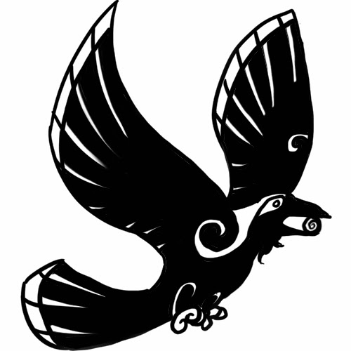
Alright, we all know I have a thing for crows by now, I'm sure. So when assigned to make a SLAM (Student Literary Arts Magazine) cover, I had to go with a native-american styled crow. (Fun fact: According to something like the 'native American zodiac' if you care to call it that, I'm a Raven. I don't really take stock in these things, but it's a cute factoid, though I have no idea who establishes these zodiac rules). 
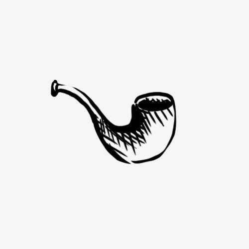
With it, I made a little raven Folio. The next one is a cover comprised of pictures from my trip to the UK. There's two irish coasts, a British building, and a statue of Sherlock Holmes all in the same image. For a folio, there was nothing especially iconic from the latter picture, so I drew up a quick version of Sherlock's pipe. It might be cheating a bit, but it was the best I had.

I used Photoshop and my Cintiq tablet to create all four images, the Crow cover being entirely my drawings and some royalty-free stock images of the moon and the Earth (though the ravens were based on some royalty-free stock photos as well), and the Holmes cover being entirely my own photos with filters and colouring. I couldn't say which was harder, but I had to press my imagination a bit to come up with new ideas.

Shape Animation

Post one of three for today, is Soul of Silicon. The idea was to make a simple animation with the shape tool in Adobe After Effects. Being who I am, I of course opted to work with a robot.

My biggest problem here was probably the layers. I'm still not entirely certain how layers work, or rather how to make new ones, but I think I did alright. I think this was truthfully done with just two layers, and a bunch of shapes on the same layers. Not my ideal, but it worked out alright.

The idea behind the wordless story is a robot briefly enjoying a moment of humanity as its little heart beats, then shorting out. Its soul flies off as it passes on. Not bad for a thirty second animation with the shape tool, I think.

Sunday, February 8, 2015

Thematic Text Before and After


These I made in Photoshop, and animated with Adobe Edge. 
I chose the word based on a Lindsey Stirling song by the same name, and partly because I had a Pinterest tutorial open that showed how to draw crystals. I didn't really take it precisely, and the crystals look a little bit soft for my taste, but I think it shows the meaning of the word, and doesn't look half bad while animated, either. (The actual animation has the before and after buttons, of course, these are just the before and after images themselves). Rather than white text, I opted for a very pale blue, it seemed more in-theme.

The project wasn't terribly difficult, but if I were to do it again, I think I would have spaced the letters a bit further and made them cel-shaded rather than soft shaded as they are here. Live and learn. All the same, I don't think it's too bad, either. 

Drawing Tablet Artwork

This week, my first of two projects was "draw something with a drawing tablet".

I have a Cintiq tablet at home, the third tablet I've ever owned. While it's a bit fiddly with its cords, it's a fantastic bit of machinery,  and even displays what I'm looking at, making it very useful (though I wish I had two screens to use it with). At any rate, using a Wacom tablet isn't a new thing to me. So as an entirely unrelated project, I was commissioned to draw a piece for a friend online. The friend offered to pay me up to $30 for a drawing of her character, and I was perfectly ready to jump at the chance! With that, my drawing (the "trial" version):


Yes okay it's a dreadful watermark, but that's not the important thing here.
I worked in Photoshop, with primarily hard round brushes. There are flat colours in this, but overtop of those is a shadow layer and an overlay highlight layer, which I think makes up for the 'flat' colours. This is just how I start most of my pictures. The background was a quickly whipped-together cloud (I had already gone well past my three-hour time allotment for this picture) but the important part is that the piece is done. A fairly well-designed anthro character (their design) for the commission price. I still have yet to get their reaction, but I imagine they're likely to enjoy it. 
Most everything I draw digitally is with a tablet, so this really wasn't a challenge for me. I just had to show off whatever I worked on most recently, and this was it!